Designer interview — Floor van Lierop, book designer of Ans Westra: A Life in Photography
.jpg&w=1920&q=75)
Floor, hi! Can you tell us about yourself and your book design career? Kia ora! I’m Floor van Lierop and I'm a graphic designer from the Netherlands. I moved to Aotearoa 15 years ago, with my partner and young family. We were looking for a different, more outdoorsy lifestyle and found it in beautiful, sunny Nelson. I've been working as a designer since graduating art school but didn't do much book design until 2018 when I met Robbie Burton of Potton & Burton Publishing. Robbie was willing to let me design a whole range of books for him and I couldn't believe how much I loved it! After a while other publishers started approaching me as well and book design has since become my main type of design work.

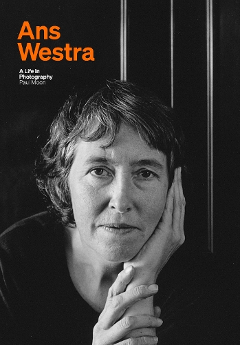
What’s your usual design process when you start laying out a book? Like most designers I tend to be very much directed by the content of the book and the material supplied. I start by looking at the images if there are any and by reading parts of the text to get a feel for the vibe, structure and extent of the book. Most publishers provide a design brief that outlines any ideas and wishes they have for the design so that's a really helpful starting point for further research and experimentation with typography and composition. That then leads to the first design mock-ups made with the elements supplied by the publisher. Ans was Dutch and you are Dutch. Did that inform some of your design thinking? To some extent, yes. Of course I was aware of our shared motherland and migration to the other side of the world and I wanted to honour her with a design that I hope she would have approved of. I also felt that it would be appropriate for the book to have a slightly Dutch feel to reflect Ans' background. It's not easy to define what 'a Dutch feel' actually looks like in terms of the layout of a book like this – perhaps a fairly minimalistic, clean layout and fuss free approach? But having grown up exposed to the visual culture of the Netherlands and having been educated there as a designer means I probably infuse a certain amount of 'Dutchness' into whatever I make anyway so it didnt require any special effort. What are some of the subtle design choices you made? I wanted Ans' photos throughout the book to be prominent in size while still having a good amount of white space around them so they wouldn't feel constrained on the page. I thought that (longer) captions straight under and between photos could look cluttered and distract from the work so I positioned them in narrow frames to the side of the images towards the gutter (center) of the book. Another subtle but I think effective design choice was the use of the bright orange. The team at Massey University Press indicated they were keen on a strong colour on the cover to offset the black tones of the book and I thought that a bright orange would look great while clearly linking it to Ans' motherland. The orange is not used in the internals of the book as that would have driven the costs up significantly but it works really well on the cover and endpapers, leading you into and out of the book. What was the biggest challenge in designing Ans Westra? The whole process was very straight forward really, the team at MUP were wonderful to work with and supplied all content and input clearly and timely. Figuring out the cover design was probably the most challenging as we tried to work out the best photo, composition and approach. I'm really happy with the design Dick and Jane came up with – the way Ans' face just draws you in is fantastic – and I love that they have a family connection to Ans. Did you know who Ans Westra was before you designed this book? I had never heard of Ans Westra in the Netherlands but saw a great documentary about her on TVNZ in 2009 and couldn't believe the amazing things this Dutch woman had done in Aotearoa. Then a decade later my partner Klaasz Breukel provided visuals and stage design for Aperture, a play about Ans Westra. I learned a lot about Ans and her work as Klaasz and writer/performer Martine Baanvinger prepared for the play with the support of Ans and her family, and came to realise how extraordinary she was. She had such an independent spirit and staunch attitude to life and art, coupled with a great eye for detail and of course huge aroha for Māori culture and the people of Aotearoa. It was an incredible honour for me to be asked to design Paul Moon's book about her and I’m really pleased with how it has turned out.
About the book:
[Embedded entry: 67lVIT3VNUHSpeH3fb3G0H]
The photographer Ans Westra, who died in 2023, took hundreds of thousands of images over her long career. Together, those images constitute what is arguably a photo album of Aotearoa. Her dedication and determination sometimes came at a cost but she was focused and driven, overcoming a difficult childhood in the Netherlands and later complex adult relationships to forge her own path. Warm, engaging and sympathetic, this richly illustrated biography interrogates her remarkable - and at times controversial - practice and a life that always put photography first.
About the author: Dr Paul Moon ONZM is a professor of history at Auckland University of Technology, where he has taught since 1993. He is the author of many books, including biographies of James Busby, William Hobson, Robert FitzRoy, and the Ngapuhi rangatira Hone Heke and Hone Heke Ngapua. In 2003, he was elected a Fellow of the Royal Historical Society at University College, London.